The Impact of Colors and Design on the Effectiveness of Fast Food Advertising
Color and design are far more than aesthetic choices in the world of fast food advertising. They are powerful psychological tools that influence customer behavior, shape brand perception, and drive sales. From the red and yellow of McDonald’s iconic arches to the sleek black and white of modern burger chains, every visual element is carefully chosen to spark hunger, evoke emotions, and remain memorable. This article explores how the strategic use of colors and design elements directly impacts the effectiveness of fast food advertising, backed by scientific research, real-world examples, and data-driven insights.
The Psychology of Color in Fast Food Advertising
Color psychology is a well-established field that examines how different hues affect human emotions and behaviors. In fast food advertising, specific colors are consistently chosen for their ability to trigger appetite and influence decisions.
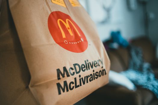
Red, for example, is the most frequently used color in global fast food branding. According to a study by Colorcom, red can increase heart rate and create a sense of urgency, encouraging quick decisions—an ideal effect for fast food environments. Yellow, often paired with red, is associated with happiness and attention. Brands like McDonald’s, Burger King, and In-N-Out Burger all use red and yellow in their logos and restaurant designs for this reason.
.png)
A 2018 survey by Kissmetrics found that up to 85% of consumers cite color as the primary reason for purchasing a particular product. In the context of fast food, red and yellow are not just eye-catching—they literally make people hungry. Green, blue, and white are used less frequently but can evoke freshness (Subway’s green), trust (blue in Pepsi), or cleanliness (white in Dairy Queen).
Design Principles That Drive Fast Food Sales
While color grabs attention, design guides the customer journey. Effective fast food advertising uses design principles such as simplicity, repetition, and visual hierarchy to ensure messages are quickly understood and remembered.
Simplicity is key: Fast food ads frequently feature minimal text, bold imagery, and uncluttered layouts. This mirrors the quick-service nature of the industry. For example, a billboard for Wendy’s might feature just a close-up of a burger and the slogan, “Fresh, Never Frozen.”
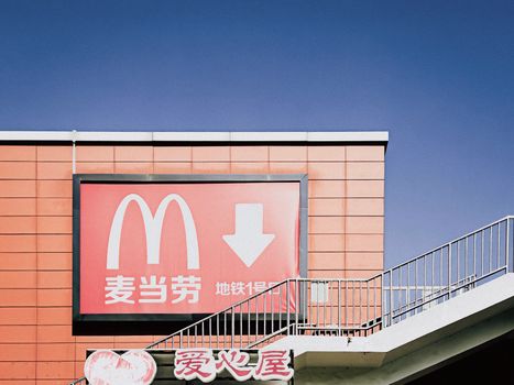
Repetition of certain design elements—like logo placement, font style, and product imagery—reinforces brand recognition. McDonald’s golden arches are instantly recognizable even without accompanying text.
Visual hierarchy directs the viewer’s attention to the most important information first, such as limited-time offers or new product launches. In a typical ad, the product image is largest, the price is bold, and the call-to-action (“Order Now!”) is clearly separated in a contrasting color.
Color Choices: Global Trends and Regional Variations
Fast food advertising is not one-size-fits-all. Cultural preferences and regional differences influence which colors and designs are most effective in different markets.
For instance, while red and yellow dominate Western fast food advertising, other regions adapt their palettes. In Japan, pastel colors and minimalist designs are popular, reflecting local aesthetics and food culture. In the Middle East, green and gold are often used to suggest abundance and quality.
According to a 2022 report by Statista, fast food brands that localized their color schemes for regional campaigns saw up to a 30% increase in engagement compared to those using a universal design. KFC’s use of green for Ramadan promotions in Indonesia is a successful example, as green is associated with the holy month and evokes positive emotions.
The table below summarizes common color associations across regions:
| Region | Popular Colors in Fast Food Ads | Common Associations | Example Brands |
|---|---|---|---|
| North America | Red, Yellow | Hunger, Speed, Happiness | McDonald’s, Wendy’s |
| Asia | Pastels, Green, Red | Freshness, Calm, Luck | Mos Burger, Lotteria |
| Middle East | Green, Gold | Abundance, Prosperity | KFC (Ramadan campaigns) |
| Europe | Red, White, Black | Quality, Modernity | Five Guys, Pret A Manger |
Case Studies: Iconic Fast Food Campaigns and Their Visual Strategies
To understand the real-world impact of color and design, it helps to look at some of the most successful fast food ad campaigns.
McDonald’s “I’m Lovin’ It” campaign is a masterclass in color psychology and design. By amplifying its signature red and yellow, using clean, simple layouts, and focusing on joyful imagery, McDonald’s achieved global recognition. Since launching in 2003, this campaign has helped the company maintain its status as the world’s largest fast food chain, with over 38,000 locations in 100+ countries as of 2023.
Taco Bell’s bold use of purple in its rebranding efforts stands out in a crowded market. Purple is rarely used in food advertising, which helps Taco Bell appear modern and edgy. The company’s playful, geometric design elements and vibrant color palette have contributed to double-digit sales growth in recent years.
Subway, in contrast, uses green and yellow to emphasize health and freshness. Their “Eat Fresh” campaign leveraged green backgrounds, fresh imagery, and minimalist layouts. According to Subway, this strategy contributed to a 7% increase in same-store sales in the first year after the campaign launched.
Digital Platforms: How Color and Design Adapt for Online Fast Food Ads
The digital revolution has shifted much of fast food advertising to online platforms, including social media, mobile apps, and streaming video. Here, color and design must be optimized for smaller screens and shorter attention spans.
A 2021 Nielsen study found that digital ads with bold, contrasting colors had a 23% higher click-through rate than those with muted palettes. Fast food brands now tailor their design strategies for platforms like Instagram and TikTok, using vibrant backgrounds, animated elements, and concise messaging.
For example, Domino’s uses blue and red in its app interface for strong contrast and readability, enhancing user experience and encouraging repeat orders. Meanwhile, Burger King’s recent “Moldy Whopper” campaign used striking green and blue hues to highlight the absence of artificial preservatives, generating massive viral attention and positive brand sentiment.
The Subtle Power of Typography, Icons, and Shapes in Fast Food Design
While color is a primary driver of emotional response, other design elements contribute to ad effectiveness. Typography, icons, and shapes all play a role in creating the fast food brand experience.
Rounded fonts and soft shapes are common, as they appear friendly and approachable. For example, Dairy Queen uses a rounded, italicized typeface to convey fun and approachability, while Starbucks’ circular logo suggests community and warmth.
Icons and imagery are also carefully chosen. A steaming burger icon, for example, immediately communicates freshness and taste. Shapes like circles and ovals are preferred for their non-threatening, welcoming feel, in contrast to harsh angles or complex patterns.
According to research by the University of Loyola, Maryland, consistent use of logos and shapes can increase brand recognition by up to 80%. This consistency is why even a partial view of the golden arches or the red KFC bucket is instantly recognizable worldwide.
Final Thoughts: Maximizing Fast Food Advertising Impact Through Visual Strategy
The effectiveness of fast food advertising hinges on more than catchy slogans or tempting photos. Strategic use of color and design is a science-backed approach that influences consumer emotions and decisions, builds lasting brand recognition, and drives sales growth.
Whether adapting to cultural preferences, optimizing for mobile screens, or leveraging the psychology of appetite, fast food brands that invest in thoughtful visual strategy consistently outperform their competitors. As the industry continues to evolve, expect even more innovative uses of color and design to shape the future of fast food advertising.